 Tassos Docs
-
- Adding an “Other” Option
- Adding a Unique ID to Each Form Submission
- Show or Hide Form Fields Based on User Joomla User Group
- Disabling Browser Autocomplete for Form Fields
- Scroll the Page to the Top When a Long Form is Submitted
- Display Submissions Count for a Specific Form
- Populate Drop Down, Radio Buttons or Checkboxes with a CSV File
- Automatically Delete Submissions Older Than X Days
- Silently POST Submitted Data to Any API or URL
- Automatically Save Each Submission to a JSON file
- Authenticate and Login a User with a Custom Joomla Form
- Auto-Populate a Form Field with an Article Data
- Add a placeholder text to a Dropdown
- Create Multilingual Forms in Joomla
- Create a custom Joomla User Registration Form
- Redirect User to a URL After Form Submission
- Importing and Exporting Forms
- Exporting Form Submissions
- Convert Forms
-
- How to Create a Quiz Form
- Displaying a Popup After Form Submission Using EngageBox
- Conditional Content Shortcode in Convert Forms
- Copy Value From One Field to Another
- Tasks
- Exporting Form Submissions with a Webhook URL
- Conditional Fields
- PDF Form Submissions
- Input Masks
- Field Calculations
- Auto-Populate Form Fields Using Query String
- Use Smart Tags
-
- Enable Minimum Time to Submit
- Restrict Form Submissions Based on IP
- Enforcing a Custom Password Policy in Convert Forms
- Add Cloudflare Turnstile to your Joomla Form
- Implement the Iubenda Consent Database in Joomla with Convert Forms
- Add Custom Validations to Fields and Forms
- Add Math Captcha to your Form
- Prevent a Field From Saving in the Database
- Add hCaptcha to your Form
- Enable Double Opt-in
- Allow Form Submissions in Specific Date Range
- Ensure a Unique Value is Entered Into a
- Block Form Submissions Containing Profanity (Bad Words)
- Block Email Addresses or Email Domains
- Add Honeypot Protection
- Setting Up Google reCAPTCHA
- Create GDPR Compliant Forms
Create Multi-Column Form Layouts
The ability to easily align form fields into row and multiple-column form layouts is one of the most requested features in the form builders world. Who wants boring and vertically aligned fields all the time? Considering that, we’ve decided that easy, CSS-free row and column form layouts need to be a core feature for Convert Forms. Let's see how you can create multiple-column layouts in Joomla.
How to Make Multiple Column Form Layouts
With the release of Convert Forms 2.0 a new option called CSS Classes is available under field settings panel. This option enables you to create advanced form layouts using a collection of predefined CSS Classes. To do this, you need to know exactly zero CSS.
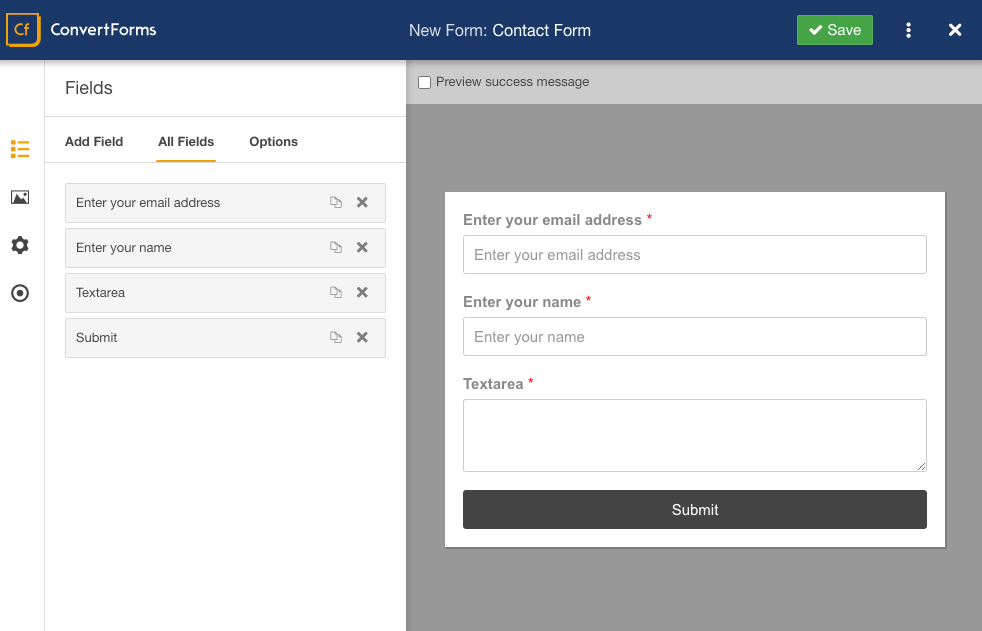
Suppose we have a single-column form just like in the screenshot below:
And we want our Email and Name fields to appear next to each other and for each to take up half of the form width.
Let’s see the 2 available ways to make that happen:
Add CSS Classes using the Layouts Panel
The easiest way to structure your columns is by using the Layouts Panel.
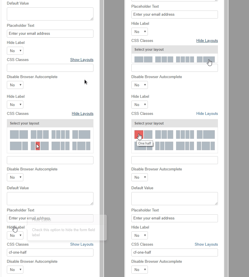
Let’s see how to do this step by step.
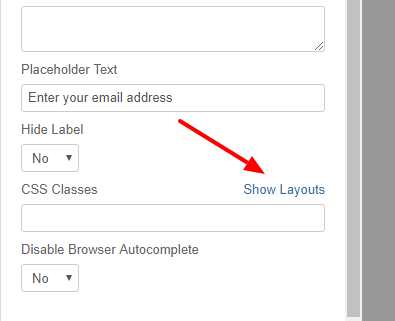
Click on the Email field in the builder to open its field setting. From the Advanced Options section of the Field Options screen, select Show Layouts to see all available column options.
To make the Email field take up half of the form width, we’ll select the option that shows two even-sized boxes.
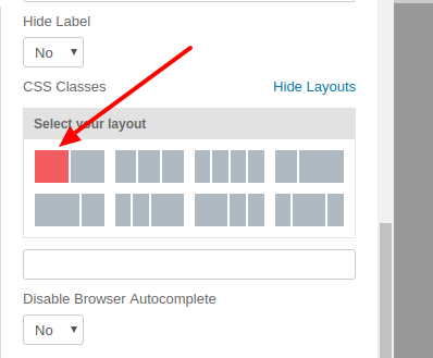
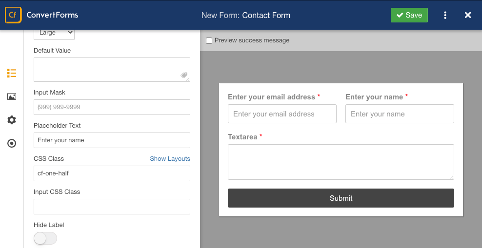
The corresponding classes are automatically added to our CSS Classes field by clicking on a column. The “cf-one-half” class tells the field to take up half the available width.

Next, we must follow the same process to put the Name field in the right column. Once you complete this step as well, your form will look like this in the screenshot below:
Add CSS Classes Manually
If you prefer not to use the Layout Panel, you can manually type in CSS classes. Here are all of the available CSS classes for layouts:
- cf-one-half
- cf-one-third
- cf-one-fourth
- cf-one-fifth
- cf-one-sixth
- cf-two-thirds
- cf-two-fourths
- cf-two-fifths
- cf-two-sixths
- cf-three-fourths
- cf-three-fifths
- cf-three-sixths
- cf-four-fifths
- cf-five-sixths
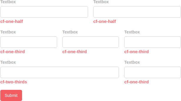
The image below shows three different common column layouts. The red text below each field shows the CSS classes used from the list above.
CSS Classes by Screen Size
These CSS classes control the width of elements based on the screen size (viewport). They allow you to create responsive layouts that adjust automatically as the screen size changes.
Screen Size Categories:
- Default: Applies to all screen sizes unless specified otherwise.
- Small (
sm): For screens 640px and wider. - Medium (
md): For screens 768px and wider. - Large (
lg): For screens 1024px and wider. - Extra-large (
xl): For screens 1280px and wider.
How the Classes Work:
Each class follows this pattern: .cf:{screen}:w-{fraction}
- {screen}: Represents the screen size category (like sm, md, etc.).
- {fraction}: Represents the portion of the width (like 1/2, 1/3, etc.).
Fractional Width Classes:
Each screen size category supports the same fractional width classes, where the fraction determines the element’s width as a percentage of the parent container.
| Fraction | Width (%) | Example CSS Class |
|---|---|---|
1/2 |
50% | .cf:w-1/2, .cf:sm:w-1/2 |
1/3 |
33.33% | .cf:w-1/3, .cf:md:w-1/3 |
2/3 |
66.67% | .cf:w-2/3, .cf:lg:w-2/3 |
1/4 |
25% | .cf:w-1/4, .cf:xl:w-1/4 |
3/4 |
75% | .cf:w-3/4, .cf:sm:w-3/4 |
1/5 |
20% | .cf:w-1/5, .cf:md:w-1/5 |
4/5 |
80% | .cf:w-4/5, .cf:lg:w-4/5 |
1/6 |
16.67% | .cf:w-1/6, .cf:xl:w-1/6 |
5/6 |
83.33% | .cf:w-5/6, .cf:sm:w-5/6 |
1/12 |
8.33% | .cf:w-1/12, .cf:md:w-1/12 |
11/12 |
91.67% | .cf:w-11/12, .cf:lg:w-11/12 |
full |
100% | .cf:w-full, .cf:xl:w-full |
Example Interpretation:
-
.cf:w-1/2: Sets width to 50% across all screen sizes. -
.cf:sm:w-1/3: Sets width to 33.33% for small screens (≥ 640px) and above. -
.cf:md:w-1/4: Sets width to 25% for medium screens (≥ 768px) and above. -
.cf:lg:w-3/4: Sets width to 75% for large screens (≥ 1024px) and above. -
.cf:xl:w-full: Sets width to 100% for extra-large screens (≥ 1280px) and above.
How to split form fields into 2 columns
To split form fields into 2 columns automatically, follow the steps below:
- Add columnRight to the CSS Class option to every field you would like to appear in the 2nd column
- Place the following Javascript code into the Custom Code option of your form. Remember to replace formID variable with the ID of your form
// Set here the ID of the form
var formID = 1;

// Do not ebit below
document.addEventListener('DOMContentLoaded', function() {
    document.querySelectorAll('#cf' + formID).forEach(form => {
        let leftWrapper = document.createElement('div');
        leftWrapper.classList.add('cf-one-half');

        let rightWrapper = document.createElement('div');
        rightWrapper.classList.add('cf-one-half');

        form.querySelector('.cf-fields').append(leftWrapper, rightWrapper);

        form.querySelectorAll('.cf-control-group').forEach(el => {
            if (el.classList.contains('columnRight')) {
                rightWrapper.appendChild(el);
            } else {
                leftWrapper.appendChild(el);
            }
        });
    })
})
Additional Note for Layouts
In most cases, when using the column classes you should set the Field Size (also under Advanced Options) to Large. This allows the field to fill all available space in its column and keeps right and left spacing even against neighboring fields.
That’s it! You can now optimize your form space with multi-column layouts.



 Rated: